Code
# Import the data and load some packages
library(tidyverse)
library(rattle)
data(weatherAUS)
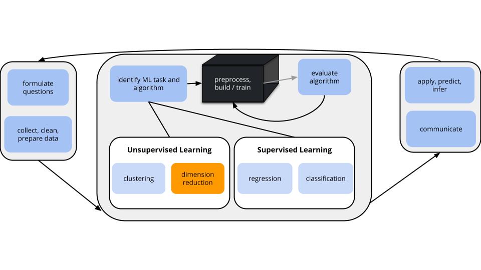
In unsupervised learning we don’t have an outcome variable; we’re just exploring the structure of our data. This can be divided into 2 types of tasks:
Especially when we have a lot of features, dimension reduction helps:
PCA is pretty cool.
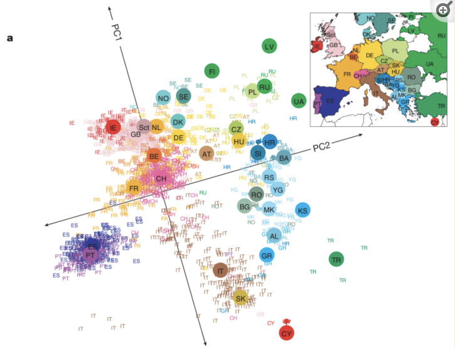
Check out this article “Genes mirror geography in Europe” which examined more than 500,000 DNA sites on 3,000 Europeans.
Thus we have high dimensional data with 3,000 rows (n) and 500,000 columns (p), thus p > n. We can capture much of the geographic relationship by reducing these 500,000 features to just 2 principal components!
The section here provides a general overview of the PCA algorithm. The details require linear algebra, which is not a pre-req for this course. If you’re curious, some details are provided in the Deeper Learning section below. You should also consider taking MATH/COMP 365: Computational Linear Algebra to learn more!
PRINCIPAL COMPONENT ANALYSIS
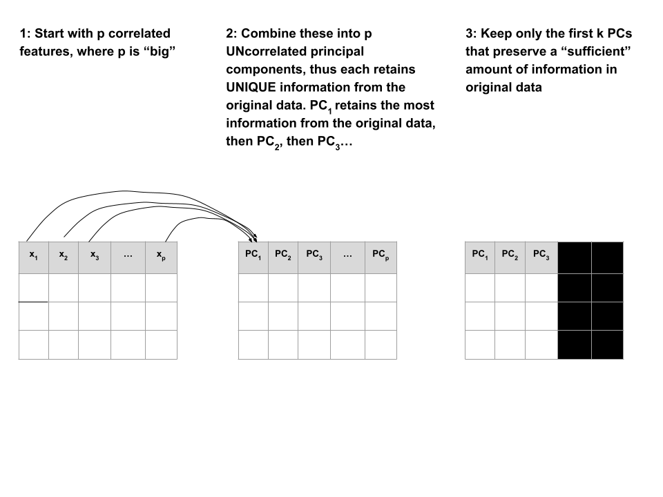
Suppose we start with high dimensional data with \(p\) potentially correlated features: \(x_1\), \(x_2\), …, \(x_p\).
We want to turn these into a smaller set of k < p features or principal components \(PC_1\), \(PC_2\), …., \(PC_k\) that:
Step 1
Define the p principal components as linear combinations of the original \(x\) features. These combinations are specified by loadings or coefficients \(a\):
\[\begin{split} PC_1 & = a_{11} x_1 + a_{12} x_2 + \cdots + a_{1p} x_p \\ PC_2 & = a_{21} x_1 + a_{22} x_2 + \cdots + a_{2p} x_p \\ \vdots & \\ PC_p & = a_{p1} x_1 + a_{p2} x_2 + \cdots + a_{pp} x_p \\ \end{split}\]
The first PC \(PC_1\) is the direction of maximal variability – it retains the greatest variability or information in the original data.
The subsequent PCs are defined to have maximal variation among the directions orthogonal to / perpendicular to / uncorrelated with the previously constructed PCs.
Step 2
Keep only the subset of PCs which retain “enough” of the variability / information in the original dataset.
Recall the Australian weather data from earlier this semester:
# Import the data and load some packages
library(tidyverse)
library(rattle)
data(weatherAUS)# check it out
head(weatherAUS)# A tibble: 6 × 24
Date Location MinTemp MaxTemp Rainfall Evaporation Sunshine WindGustDir
<date> <chr> <dbl> <dbl> <dbl> <dbl> <dbl> <ord>
1 2008-12-01 Albury 13.4 22.9 0.6 NA NA W
2 2008-12-02 Albury 7.4 25.1 0 NA NA WNW
3 2008-12-03 Albury 12.9 25.7 0 NA NA WSW
4 2008-12-04 Albury 9.2 28 0 NA NA NE
5 2008-12-05 Albury 17.5 32.3 1 NA NA W
6 2008-12-06 Albury 14.6 29.7 0.2 NA NA WNW
# ℹ 16 more variables: WindGustSpeed <dbl>, WindDir9am <ord>, WindDir3pm <ord>,
# WindSpeed9am <dbl>, WindSpeed3pm <dbl>, Humidity9am <int>,
# Humidity3pm <int>, Pressure9am <dbl>, Pressure3pm <dbl>, Cloud9am <int>,
# Cloud3pm <int>, Temp9am <dbl>, Temp3pm <dbl>, RainToday <fct>,
# RISK_MM <dbl>, RainTomorrow <fct>Note that the data has some missing values:
colSums(is.na(weatherAUS)) Date Location MinTemp MaxTemp Rainfall
0 0 4678 4631 8094
Evaporation Sunshine WindGustDir WindGustSpeed WindDir9am
160126 171126 20466 20265 21454
WindDir3pm WindSpeed9am WindSpeed3pm Humidity9am Humidity3pm
12406 5948 10688 6229 11461
Pressure9am Pressure3pm Cloud9am Cloud3pm Temp9am
30385 30362 126519 132708 4634
Temp3pm RainToday RISK_MM RainTomorrow
9982 8094 8093 8093
NOTE: PCA cannot handle missing values.
We could simply eliminate days with any missing values (e.g., na.omit()), but this would kick out a lot of useful info.
Instead, we’ll use KNN to impute the missing values using the VIM package.
# If your VIM package works, use this chunk to process the data
library(VIM)

# It would be better to impute before filtering & selecting
# BUT it's very computationally expensive in this case
weather_temp <- weatherAUS %>%
  filter(Date == "2008-12-01") %>%
  dplyr::select(-Date, -RainTomorrow, -Temp3pm, -WindGustDir, -WindDir9am, -WindDir3pm) %>%
  VIM::kNN(imp_var = FALSE)

# Now convert Location to the row name (not a feature)
weather_temp <- weather_temp %>%
  column_to_rownames("Location")

# Create a new data frame that processes logical and factor features into dummy variables
weather_data <- data.frame(model.matrix(~ . - 1, data = weather_temp))
rownames(weather_data) <- rownames(weather_temp)
# check it out
# notice that all the NAs have been filled in!
head(weather_data) MinTemp MaxTemp Rainfall Evaporation Sunshine WindGustSpeed
Albury 13.4 22.9 0.6 7.4 10.1 44
Newcastle 13.2 27.2 0.0 7.4 13.0 44
Penrith 15.2 32.6 0.0 7.4 10.9 59
Sydney 17.6 31.3 0.0 7.6 10.9 44
Wollongong 9.5 17.9 0.4 6.8 10.1 52
Canberra 13.6 25.2 0.0 9.6 13.0 80
WindSpeed9am WindSpeed3pm Humidity9am Humidity3pm Pressure9am
Albury 20 24 71 22 1007.7
Newcastle 6 19 50 24 1013.9
Penrith 13 22 35 23 1009.1
Sydney 2 24 29 21 1009.1
Wollongong 20 24 52 44 1007.9
Canberra 26 43 31 28 1006.3
Pressure3pm Cloud9am Cloud3pm Temp9am RainTodayNo RainTodayYes
Albury 1007.1 8 5 16.9 1 0
Newcastle 1010.1 3 4 21.8 1 0
Penrith 1007.1 3 4 24.4 1 0
Sydney 1004.6 3 7 24.9 1 0
Wollongong 1003.3 5 5 14.0 0 1
Canberra 1004.4 1 6 19.9 1 0
RISK_MM
Albury 0
Newcastle 0
Penrith 0
Sydney 0
Wollongong 0
Canberra 0If your VIM package doesn’t work, import the processed data from here:
weather_data <- read.csv("https://kegrinde.github.io/stat253_coursenotes/data/weatherAUS_processed_subset.csv") %>%
  column_to_rownames("Location")
Check out the weather_data:
head(weather_data)
##            MinTemp MaxTemp Rainfall Evaporation Sunshine WindGustSpeed
## Albury        13.4    22.9      0.6         7.4     10.1            44
## Newcastle     13.2    27.2      0.0         7.4     13.0            44
## Penrith       15.2    32.6      0.0         7.4     10.9            59
## Sydney        17.6    31.3      0.0         7.6     10.9            44
## Wollongong     9.5    17.9      0.4         6.8     10.1            52
## Canberra      13.6    25.2      0.0         9.6     13.0            80
##            WindSpeed9am WindSpeed3pm Humidity9am Humidity3pm Pressure9am
## Albury               20           24          71          22      1007.7
## Newcastle             6           19          50          24      1013.9
## Penrith              13           22          35          23      1009.1
## Sydney                2           24          29          21      1009.1
## Wollongong           20           24          52          44      1007.9
## Canberra             26           43          31          28      1006.3
##            Pressure3pm Cloud9am Cloud3pm Temp9am RainTodayNo RainTodayYes
## Albury          1007.1        8        5    16.9           1            0
## Newcastle       1010.1        3        4    21.8           1            0
## Penrith         1007.1        3        4    24.4           1            0
## Sydney          1004.6        3        7    24.9           1            0
## Wollongong      1003.3        5        5    14.0           0            1
## Canberra        1004.4        1        6    19.9           1            0
##            RISK_MM
## Albury           0
## Newcastle        0
## Penrith          0
## Sydney           0
## Wollongong       0
## Canberra         0
Identify a research goal that could be addressed using one of our clustering algorithms.
Identify a research goal that could be addressed using our PCA dimension reduction algorithm.
Let’s start with just 3 correlated features: \(x_1\) (Temp9am), \(x_2\) (MinTemp), and \(x_3\) (WindSpeed9am)
small_example <- weather_data %>%
  select(Temp9am, MinTemp, WindSpeed9am)

pairs(small_example)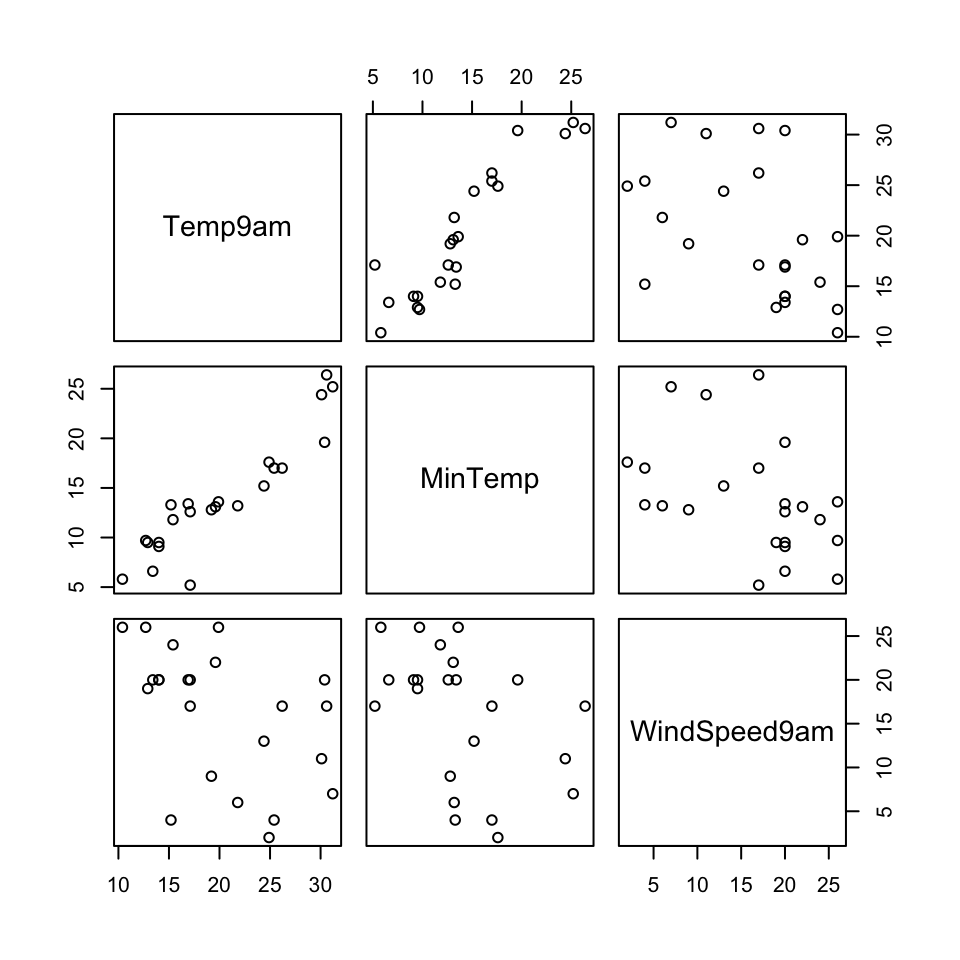
The goal of PCA will be to combine these correlated features into a smaller set of uncorrelated principal components (PCs) without losing a significant amount of information.
The first PC will be defined to retain the greatest variability, hence information in the original features. What do you expect the first PC to be like?
How many PCs do you think we’ll need to keep without losing too much of the original information?
Perform PCA on the small_example data:
# This code is nice and short!
# scale = TRUE, center = TRUE first standardizes the features
pca_small <- prcomp(small_example, scale = TRUE, center = TRUE)
This creates 3 PCs which are each different combinations of the (standardized) original features:
# Original (standardized) features
scale(small_example) %>%
  head()
Temp9am MinTemp WindSpeed9am
Albury -0.49164877 -0.10016777 0.5179183
Newcastle 0.25610853 -0.13455372 -1.3350783
Penrith 0.65287772 0.20930578 -0.4085800
Sydney 0.72917948 0.62193718 -1.8645059
Wollongong -0.93419901 -0.77069379 0.5179183
Canberra -0.03383817 -0.06578182 1.3120597# PCs
pca_small %>%
pluck("x") %>%
head() PC1 PC2 PC3
Albury -0.6119817 0.27733759 -0.26182765
Newcastle 0.6944764 -1.15487603 0.22381760
Penrith 0.7312569 -0.09374376 0.30573078
Sydney 1.7089610 -1.21413476 0.01482615
Wollongong -1.3091122 -0.09282229 -0.11200583
Canberra -0.6683498 1.12907017 0.07404101Specifically, these PCs are linear combinations of the (standardized) original x features, defined by loadings a:
\(PC_1 = a_{11}x_1 + a_{12}x_2 + a_{13}x_3\)
\(PC_2 = a_{21}x_1 + a_{22}x_2 + a_{23}x_3\)
\(PC_3 = a_{31}x_1 + a_{32}x_2 + a_{33}x_3\)
And these linear combinations are defined so that the PCs are uncorrelated, thus each contain unique weather information about the cities!
pca_small %>%
  pluck("x") %>%
  pairs()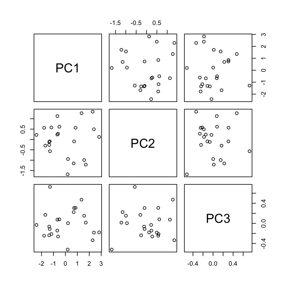
Use the loadings below to specify the formula for the first PC.
PC1 = ___*Temp9am + ___*MinTemp + ___*WindSpeed9am
pca_small %>%
  pluck("rotation")
PC1 PC2 PC3
Temp9am 0.6312659 0.2967160 0.71656333
MinTemp 0.6230387 0.3562101 -0.69637431
WindSpeed9am -0.4618725 0.8860440 0.03999775# Original (standardized) coordinates
scale(small_example) %>%
head(1) Temp9am MinTemp WindSpeed9am
Albury -0.4916488 -0.1001678 0.5179183# PC coordinates
pca_small %>%
pluck("x") %>%
head(1) PC1 PC2 PC3
Albury -0.6119817 0.2773376 -0.2618276
Plots can help us interpret the above numerical loadings, hence the important components of each PC.
# Plot the loadings for all 3 PCs
library(reshape2)
melt(pca_small$rotation[, 1:3]) %>%
  ggplot(aes(x = Var1, y = value, fill = Var1)) +
    geom_bar(stat = "identity") +
    facet_wrap(~ Var2) +
    labs(y = "loadings", x = "original features", fill = "original features")
# Focus on the 1st PC (this will be helpful when we have more PCs!)
melt(pca_small$rotation) %>%
  filter(Var2 == "PC1") %>%
  ggplot(aes(x = Var1, y = value, fill = Var1)) +
    geom_bar(stat = "identity") +
    labs(y = "loadings", x = "original features", fill = "original features")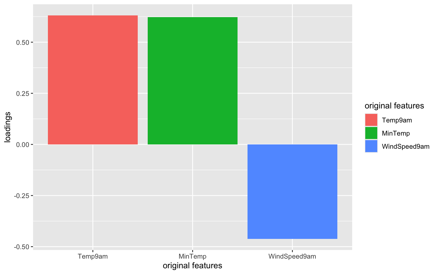
Which features contribute the most, either positively or negatively, to the first PC?
What about the second PC?
When we have a lot of features x, the above plots get messy. A loadings plot or correlation circle is another way to visualize PC1 and PC2 (the most important PCs):
It is powerful in that it can provide a 2-dimensional visualization of high dimensional data (just 3 dimensions in our small example here)!
library(factoextra)
fviz_pca_var(pca_small, repel = TRUE)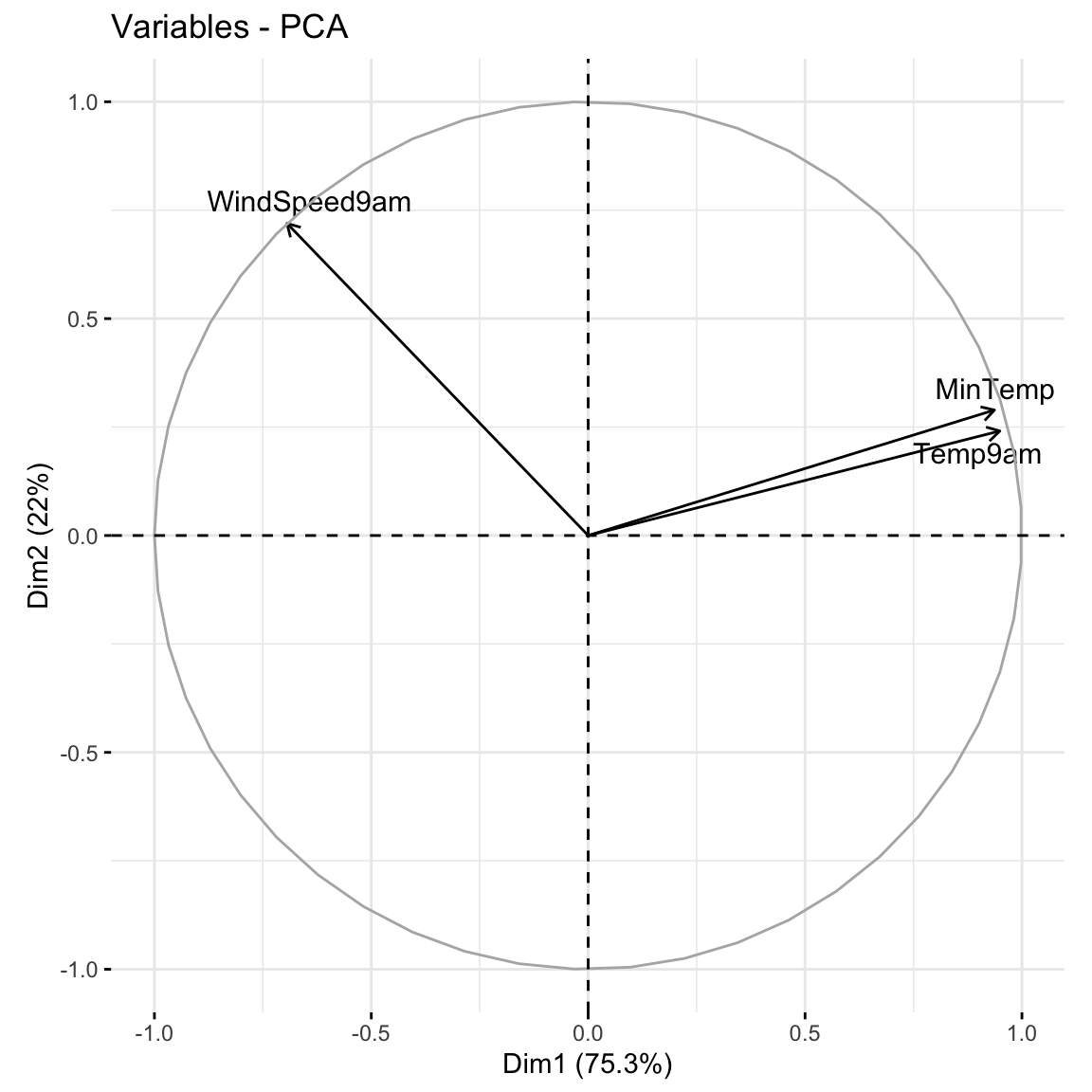
Positively correlated features point in similar directions. The opposite is true for negatively correlated features. What do you learn here?
Which features are most highly correlated with, hence contribute the most to, the first PC (x-axis)? (Is this consistent with what we observed in the earlier plots?)
What about the second PC?
Now that we better understand the structure of the PCs, let’s examine the relative amount of information they each capture from the original set of features:
# Load package for tidy table
library(tidymodels)

# Measure information captured by each PC
# Calculate variance from standard deviation
pca_small %>%
  tidy(matrix = "eigenvalues") %>%
  mutate(var = std.dev^2)
# A tibble: 3 × 5
PC std.dev percent cumulative var
<dbl> <dbl> <dbl> <dbl> <dbl>
1 1 1.50 0.753 0.753 2.26
2 2 0.812 0.220 0.973 0.660
3 3 0.284 0.0268 1 0.0805NOTE:
var = amount of variability, hence information, in the original features captured by each PCpercent = % of original information captured by each PCcumulative = cumulative % of original information captured by the PCsvar and percent columns.What % of the original information is captured by PC2?
In total, 100% of the original information is captured by PC1, PC2, and PC3. What % of the original info would we retain if we only kept PC1 and PC2, i.e. if we reduced the PC dimensions by 1? Confirm using both the percent and cumulative columns.
Especially when we start with lots of features, graphical summaries of the above tidy summary can help understand the variation captured by the PCs:
# SCREE PLOT: % of variance explained by each PC
pca_small %>%
  tidy(matrix = "eigenvalues") %>%
  ggplot(aes(y = percent, x = PC)) +
    geom_point(size = 2) +
    geom_line() +
    labs(y = "% of variance explained")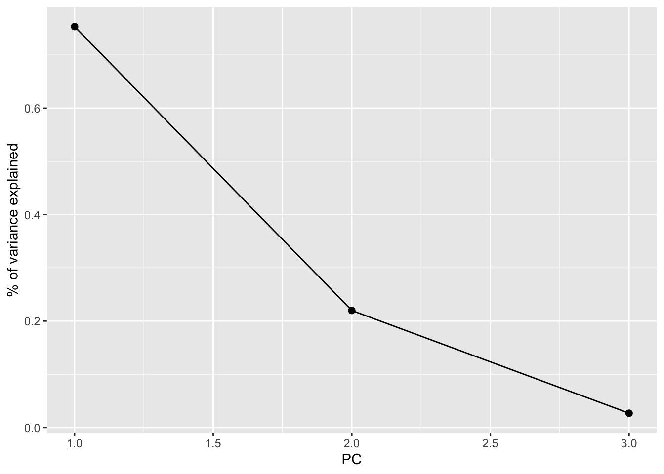
# Cumulative % of variance explained
pca_small %>%
  tidy(matrix = "eigenvalues") %>%
  rbind(0) %>%
  ggplot(aes(y = cumulative, x = PC)) +
    geom_point(size = 2) +
    geom_line() +
    labs(y = "CUMULATIVE % of variance explained")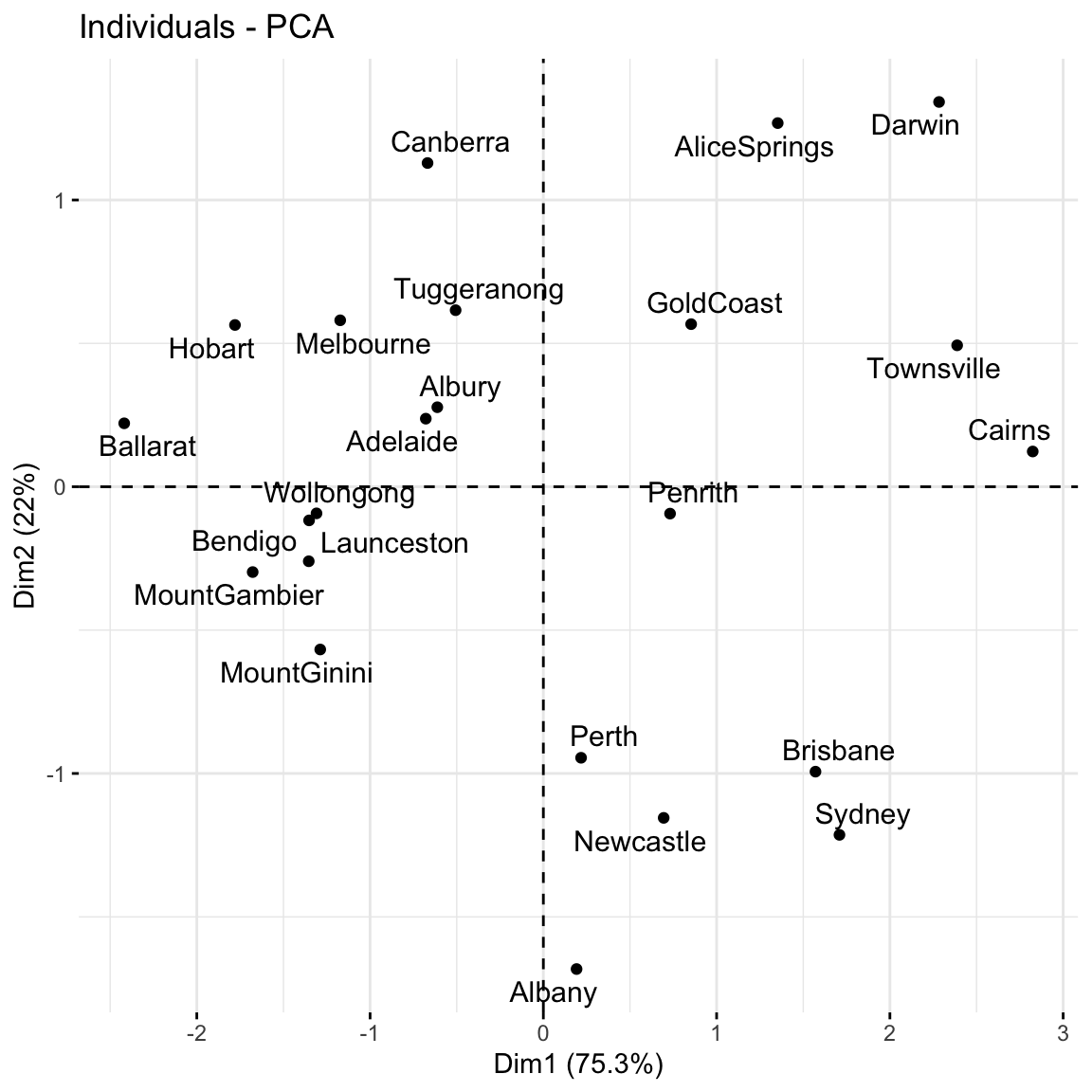
Based on these summaries, how many and which of the 3 PCs does it make sense to keep?
Thus by how much can we reduce the dimensions of our dataset?
Finally, now that we better understand the “meaning” of our 3 new PCs, let’s explore their outcomes for each city (row) in the dataset.
The below scores provide the new coordinates with respect to the 3 PCs:
pca_small %>%
  pluck("x") %>%
  head()
PC1 PC2 PC3
Albury -0.6119817 0.27733759 -0.26182765
Newcastle 0.6944764 -1.15487603 0.22381760
Penrith 0.7312569 -0.09374376 0.30573078
Sydney 1.7089610 -1.21413476 0.01482615
Wollongong -1.3091122 -0.09282229 -0.11200583
Canberra -0.6683498 1.12907017 0.07404101A score plot maps out the scores of the first, and most important, 2 PCs for each city. PC1 is on the x-axis and PC2 on the y-axis.
Again, since these PCs are linear combinations of all original features (only 3 here), a score plot can provide a 2-dimensional visualization of high dimensional data!
Question: Unless you’re familiar with Australian geography, it might be tough to ascertain any meaningful patterns here. Looking back to the map, and recalling the key information captured by PC1 and PC2, does there appear to be any geographical explanation of which cities are similar with respect to their PC1 and PC2 scores?
# Score plot: plot PC1 scores (x-axis) vs PC2 scores (y-axis) of all data points
fviz_pca_ind(pca_small, repel = TRUE)
Repeat the PCA using all 18 original features in the weather_data, our goal being to reduce the dimensions of this dataset while still maintaining a “sufficient” amount of the original information!
pca_weather <- prcomp(weather_data, scale = TRUE, center = TRUE)This produces 18 uncorrelated PCs that are linear combinations of the original (standardized) features:
pca_weather %>%
  pluck("x") %>%
  head()
PC1 PC2 PC3 PC4 PC5 PC6
Albury -0.4347320 0.6310084 -0.00249586 1.58334640 -0.75416235 0.5584570
Newcastle 1.1354168 -1.4874342 -1.68801307 -0.08843211 -0.29711827 -0.3570227
Penrith 0.5295179 -2.0629031 0.31172583 -0.40979567 -0.55894823 0.2923958
Sydney 1.0471702 -1.8638332 0.90468479 -0.19738978 -1.36015610 -0.7805383
Wollongong -2.3244856 1.5540074 0.07924589 0.03387889 0.08171723 -0.2007186
Canberra -2.6420711 -2.6213046 0.97957591 -0.87130315 -1.63498832 0.3104203
PC7 PC8 PC9 PC10 PC11
Albury -0.5030481 -1.0032728 1.49263281 -0.3770739 0.217419531
Newcastle -0.5342649 -0.8260785 -0.12901337 0.5524187 -0.019147225
Penrith 0.1669854 -0.5264088 -0.03359561 0.0720234 0.003082526
Sydney -1.4130771 -1.1624668 -1.05279963 -0.1089470 -0.059738227
Wollongong 0.5253852 -0.7279453 -0.64889066 -0.3814026 0.264308869
Canberra -0.7598967 1.5625904 0.32417904 1.1590349 0.106050706
PC12 PC13 PC14 PC15 PC16
Albury -0.91098812 0.3093372 -0.1194868349 -0.04732443 0.20006422
Newcastle -0.31768269 -0.3689492 -0.0020756144 -0.25958440 -0.12764212
Penrith -0.01413404 0.5423686 0.0751576394 0.11900530 -0.18078633
Sydney 0.37396249 0.1287991 -0.0270416392 0.30938838 0.06210685
Wollongong 0.95247931 -0.1039939 0.2175806676 -0.29571978 -0.03130589
Canberra 0.02913232 -0.3468298 -0.0001989966 -0.05693145 0.10311335
PC17 PC18
Albury -0.10798959 3.939140e-16
Newcastle 0.14708667 1.718694e-16
Penrith 0.22254521 1.718694e-16
Sydney -0.09870755 -1.056863e-16
Wollongong -0.18911254 -3.134113e-16
Canberra -0.03666081 6.159587e-16# Cumulative % of variance explained (in numbers)
pca_weather %>%
tidy(matrix = "eigenvalues")# A tibble: 18 × 4
PC std.dev percent cumulative
<dbl> <dbl> <dbl> <dbl>
1 1 2.22e+ 0 0.274 0.274
2 2 1.95e+ 0 0.212 0.486
3 3 1.62e+ 0 0.146 0.632
4 4 1.40e+ 0 0.109 0.741
5 5 1.12e+ 0 0.0696 0.810
6 6 9.25e- 1 0.0475 0.858
7 7 8.32e- 1 0.0385 0.896
8 8 6.90e- 1 0.0265 0.923
9 9 6.46e- 1 0.0232 0.946
10 10 5.68e- 1 0.0179 0.964
11 11 4.86e- 1 0.0131 0.977
12 12 4.60e- 1 0.0118 0.989
13 13 3.05e- 1 0.00517 0.994
14 14 2.33e- 1 0.00301 0.997
15 15 1.71e- 1 0.00163 0.998
16 16 1.28e- 1 0.00091 0.999
17 17 1.04e- 1 0.0006 1
18 18 1.15e-16 0 1 # Cumulative % of variance explained (plot)
pca_weather %>%
tidy(matrix = "eigenvalues") %>%
rbind(0) %>%
ggplot(aes(y = cumulative, x = PC)) +
geom_point(size = 2) +
geom_line() 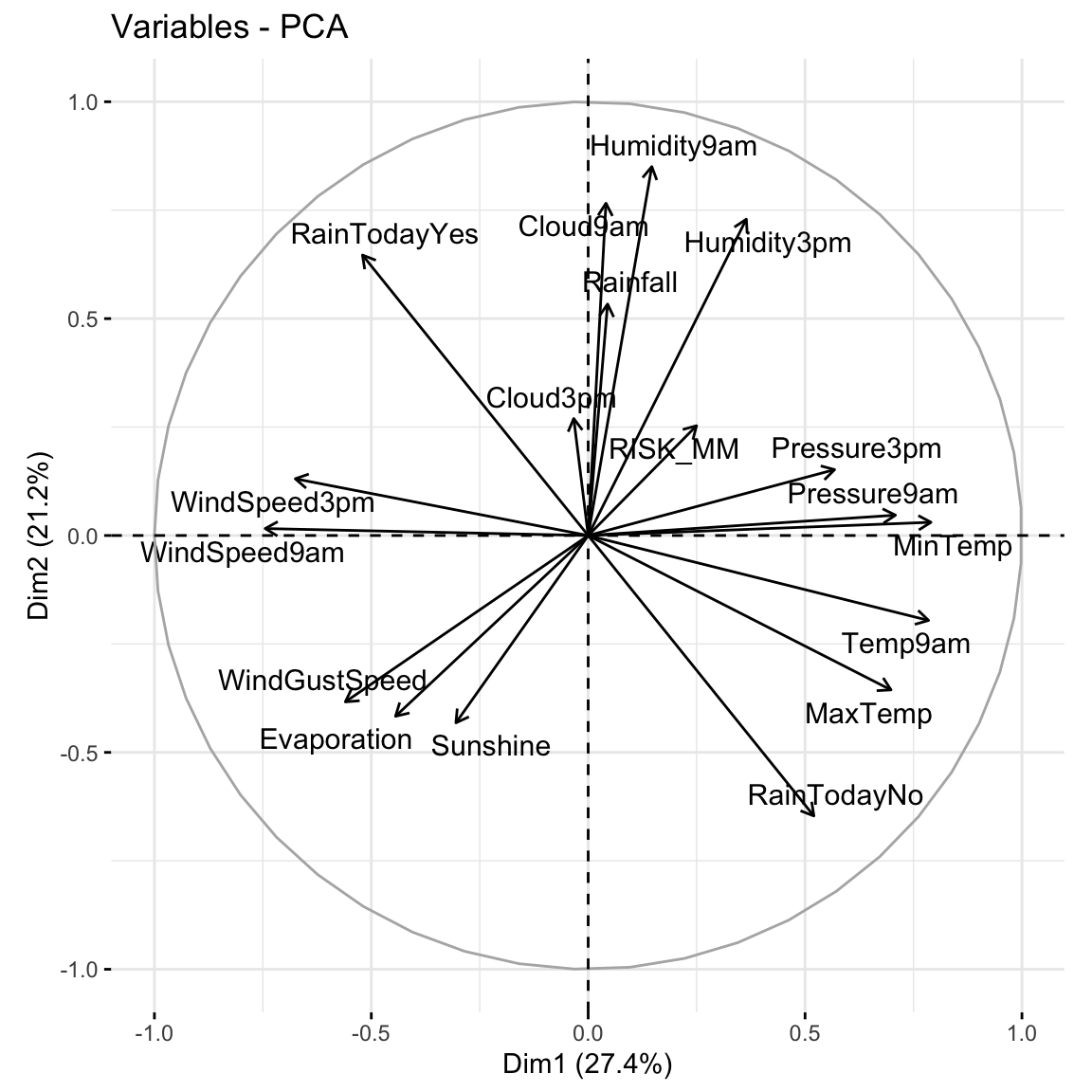
# Plot the loadings for first 5 PCs
# We have to use a different color palette -- we need enough colors for our 18 features
pca_weather$rotation %>% as.data.frame() %>% select(PC1:PC5) %>% rownames_to_column(var = 'Variable') %>% pivot_longer(PC1:PC5 ,names_to = 'PC', values_to = 'Value') %>%
  ggplot(aes(x = Variable, y = Value, fill = Variable)) +
    geom_bar(stat = "identity") +
    facet_wrap(~ PC) +
    labs(y = "loadings", x = "original features", fill = "original features") +
    scale_fill_manual(values = rainbow(18)) +
    theme(axis.title.x=element_blank(),
        axis.text.x=element_blank(),
        axis.ticks.x=element_blank())
# Loadings plot: first 2 PCs
fviz_pca_var(pca_weather, repel = TRUE)
fviz_pca_ind(pca_weather, repel = TRUE)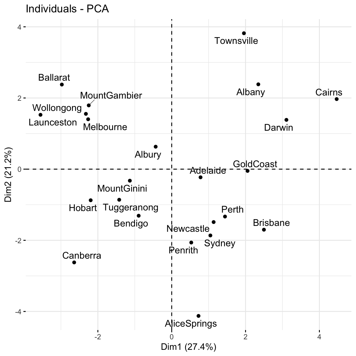
Use the rest of class time to work on HW7 (try to finish Exercises 1 and 2 today). The R Code Notes, below, will come in handy for these exercises.
Suppose we have a set of sample_data with multiple feature columns x, and (possibly) a column named id which labels each data point.
# Install packages
library(tidyverse)
PROCESS THE DATA
If there’s a column that’s an identifying variable or label, not a feature of the data points, convert it to a row name.
sample_data <- sample_data %>%
  column_to_rownames("id")
PCA can’t handle NA values! There are a couple options.
# Omit missing cases (this can be bad if there are a lot of missing points!)
sample_data <- na.omit(sample_data)

# Impute the missing cases
library(VIM)
sample_data <- sample_data %>%
  VIM::kNN(imp_var = FALSE)
IF you have at least 1 categorical / factor feature, you’ll need to pre-process the data even further. You should NOT do this if you have quantitative and/or logical features.
# Turn categorical features into dummy variables
sample_data <- data.frame(model.matrix(~ . - 1, sample_data))
RUN THE PCA
# scale = TRUE, center = TRUE first standardizes the features
pca_results <- prcomp(sample_data, scale = TRUE, center = TRUE)
CHECK OUT THE PCs
# Get the loadings which define the PCs
pca_results %>%
  pluck("rotation")

# Plot loadings for first "k" PCs (you pick k)
library(reshape2)
melt(pca_results$rotation[, 1:k]) %>%
  ggplot(aes(x = Var1, y = value, fill = Var1)) +
    geom_bar(stat = "identity") +
    facet_wrap(~ Var2) +
    labs(y = "loadings", x = "original features", fill = "original features")

# Plot loadings for just the first PC
melt(pca_results$rotation) %>%
  filter(Var2 == "PC1") %>%
  ggplot(aes(x = Var1, y = value, fill = Var1)) +
    geom_bar(stat = "identity") +
    labs(y = "loadings", x = "original features", fill = "original features")

# Loadings plot for first 2 PCs
library(factoextra)
fviz_pca_var(pca_results, repel = TRUE)
EXAMINE AMOUNT OF VARIABILITY / INFORMATION CAPTURED BY EACH PC
# Load package for tidy table
library(tidymodels)

# Numerical summaries: Measure information captured by each PC
pca_results %>%
  tidy(matrix = "eigenvalues")

# Graphical summary 1: SCREE PLOT
# Plot % of variance explained by each PC
pca_results %>%
  tidy(matrix = "eigenvalues") %>%
  ggplot(aes(y = percent, x = PC)) +
    geom_point(size = 2) +
    geom_line() +
    labs(y = "% of variance explained")

# Graphical summary 2: Plot cumulative % of variance explained by each PC
pca_results %>%
  tidy(matrix = "eigenvalues") %>%
  rbind(0) %>%
  ggplot(aes(y = cumulative, x = PC)) +
    geom_point(size = 2) +
    geom_line() +
    labs(y = "CUMULATIVE % of variance explained")
EXAMINE THE SCORES, i.e PC COORDINATES FOR THE DATA POINTS
# Numerical summary: check out the scores
pca_results %>%
  pluck("x")

# Graphical summary: Score plot
# Plot PC1 scores (x-axis) vs PC2 scores (y-axis) of all data points
fviz_pca_ind(pca_results, repel = TRUE)
For more dimension reduction techniques, check out:
Let \(X\) be our original (centered) \(n \times p\) data matrix. Mathematically, PCA produces an orthogonal linear transformation of \(X\). To this end, first note that the covariance or relationship among the features in \(X\) is proportional to the \(p \times p\) matrix
\[X^TX\]
Further, we can express this covariance structure as
\[X^TX = W \Lambda W^T\]
where \(W\) is a \(p \times p\) matrix, the columns of which are eigenvectors of \(X^TX\), and \(\Lambda\) is a diagonal matrix of eigenvalues.
Alternatively, we can obtain the principal components via singular value decomposition (SVD). Instead of decomposing \(X^TX\), SVD decomposes \(X\). In fact, this is a bit more computationally stable! Specifically, SVD expresses \(X\) as
\[X = U \Sigma W^T\]
where \(U\) is an \(n \times n\) matrix of orthogonal left singular vectors of \(X\) and \(\Sigma\) is an \(n \times p\) diagonal matrix of singular values. Then \(W\) still provides the principal components and the diagonal of \(\Sigma^2\) is equivalent to the diagonal of \(\Lambda\) since by the SVD,
\[X^TX = W \Sigma^T U^T U \Sigma W^T = W \Sigma^2 W^T\]
Further resource: https://www.hackerearth.com/blog/developers/principal-component-analysis-with-linear-algebra/
Example 1: Research goals
Example 2: Starting small
Example 3: Defining the PCs
(0.6312659 * -0.4916488) + (0.6230387 * -0.1001678) - (0.4618725 * 0.5179183)Example 4: Examining the components of each PC (part 1)
Example 5: Examining the components of each PC (part 2)
Example 6: Examining the amount of information captured by each PC (numerical metrics)
2.26 / (2.26 + 0.660 + 0.0805)[1] 0.75320780.753 + 0.220[1] 0.973Example 7: Examining the amount of information captured by each PC (SCREE plots)
Example 8: Examining the new PC coordinates of the data points (score plots)
Example 9: PCA using all features
Example 10: Drawbacks
when we have lots and lots of features, we want to simplify the data set while retaining the information, and we don’t care about losing the meaning of the original features.
if we’re specifically interested in the original features (and don’t want to combine them into tough to interpret PCs)